Feedback?

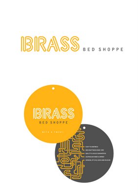
This isn't the design that was chosen for this client - I will post that when it has gone to print etc etc and has been "launched" - but this was the alternative design (which I think *pause* I prefer). What do you guys think? My boss came up with the tag line, 'with a twist' because they offer really far out colours and designs for their product (exclusively brass beds), and they are assembled by twisting the components together. The round things are swing tags (front and back) for the beds as he sells to the retailer (captn snooze, sleepymaker, or whatever they're called), so this is the main avenue which the company actually interacts with the end user. Most of the time, it has to attract the retailers. Anyways I like the idea of the brass band and instruments - I tried for identity being just a guy sitting on a chair playing the tuba, that would really make you pay attention... anyways so you can see where the inspiration for the type and brand identity came from. would people recognise this? do you? would you remember this? etc etc. Gimme a sentence.

1 Comments:
yo the lovely elliott. i like it especially that trumpet bit. that gets me all brassy and stuff.
love dan
ps. i would of made it a lighter grey, but then i could also shuv a lighter up my ass
Post a Comment
<< Home